Analytics
With WordPress Analytics in MyKinsta, you can gain deeper insight into your site’s traffic, performance, resource usage, and caching behavior through a wide range of analytics data. These reports can also help you investigate and troubleshoot certain site issues directly from the MyKinsta dashboard.
Analytics data is retained for 3 months. After migrating to Kinsta, we recommend checking your Dashboard and Analytics pages regularly to help identify unexpected traffic spikes, performance issues, or unusual activity. If you notice anything concerning or unexplained, our Support team can help investigate further.
The MyKinsta Dashboard provides a quick overview of:
- Resource usage
- Data transfer (server bandwidth)
- Unique visits to your live site
- CDN usage (when applicable)
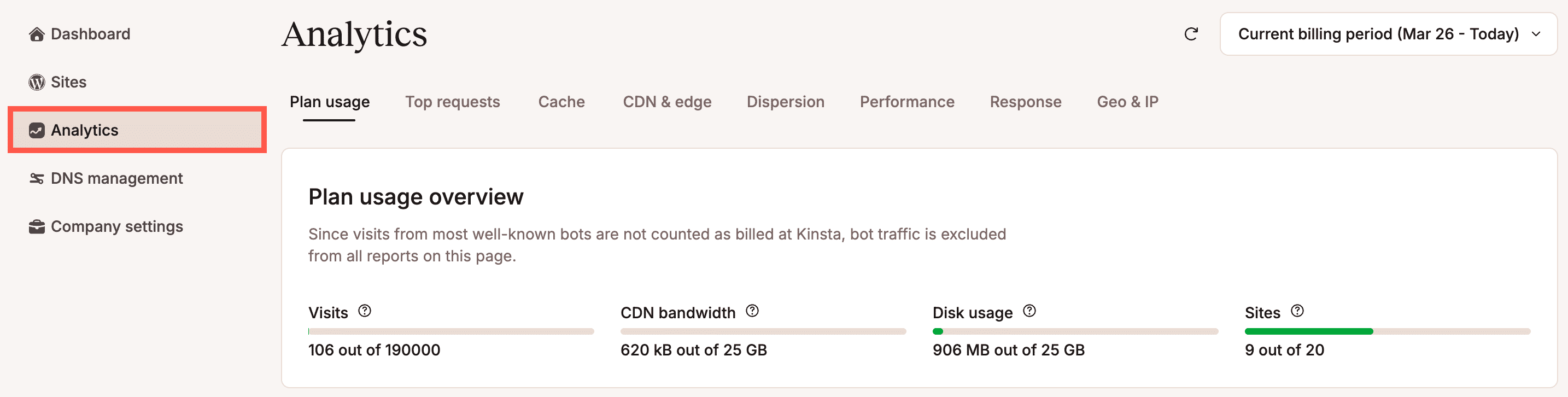
For more detailed reports across all sites in your plan, go to Analytics from your Dashboard.
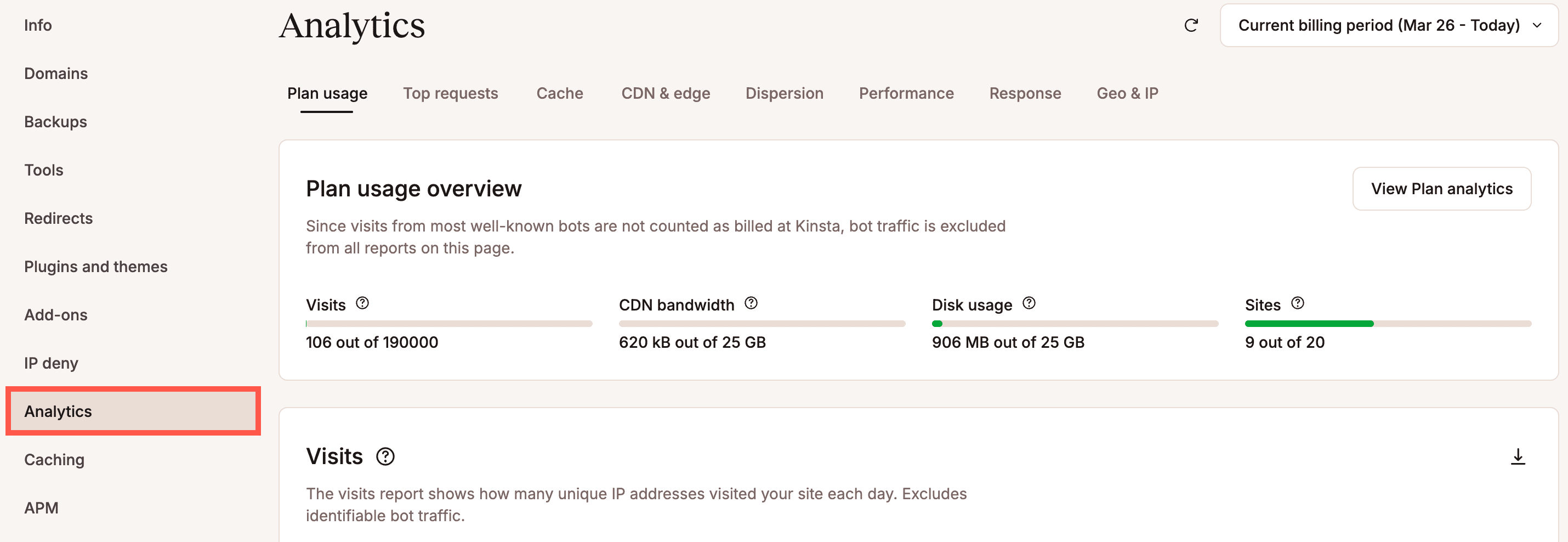
To view analytics for a specific site, go to Sites > sitename > Analytics.
All analytics charts are displayed in Coordinated Universal Time (UTC).
Date selector
Within Analytics, you can select the time frame for the charts. By default, the charts display the current billing period. To change this, click Current Billing Period, and then choose from Billing period, Relative, or Absolute options.
Billing period
This is relative to the current date and your billing period. The Past two billing periods and Current billing period options display data from your billing period up to today’s date.

Relative
The relative options show data for the specified number of days or hours, ending at the current date and time.

Absolute
Use this option to select a custom start and end date. You can choose dates up to three months prior to today.

Download analytics
You can download the data from any of the analytics charts as a .csv file by clicking the download button on the corresponding chart.

Plan usage
Under the Plan usage section, you’ll find a breakdown of your plan’s resource consumption, including visits, bandwidth, and disk space. These charts reflect billable usage, not necessarily all the traffic your site receives. All other traffic may still reach your site and affect performance, but it is not included in your billing or these charts.
What counts toward your plan usage (billable)
The following contributes towards your billing:
- A visit is counted when a unique IP address accesses your live site within a 24-hour period. A single visit to your site can result in multiple requests, each contributing to the total bandwidth consumed.
- The request is made to the live environment.
- Requests from the CDN or edge cache are still counted as visits, but they are excluded from server bandwidth.
What does not count toward your plan usage
The following traffic may still reach your site and consume resources, but it is excluded from billing:
- Requests from most recognized bot user agents (we automatically filter these).
- Requests to staging environments (premium and standard).
- Requests that return status codes 401, 403, 429, 451, 499, or 501.
- Requests to wp-login.php.
Plan usage overview
The plan usage overview shows the totals for all sites in your company’s plan. Disk usage information is calculated once every day for each website at various times. This means the amount of disk space used can vary during the day, and the total for all websites might not be entirely accurate until the next day.

Plan usage distribution
The plan usage distribution report is only available within the company’s Analytics. It shows you a breakdown of the number of visits, CDN bandwidth, disk space usage, and server bandwidth usage for each WordPress site in your company plan. Disk Space refers to the storage capacity currently in use and always displays the most recent data within the specified time frame. You can sort this chart by Visits, CDN bandwidth, Disk space, or Server bandwidth in ascending or descending order by clicking on the corresponding header.
Kinsta’s hosting plans are based on either the total number of visitors to your live sites or the total monthly server bandwidth used by your live sites. This table shows how much of your plan each site uses. The disk space usage helps you identify which sites may require further analysis for troubleshooting issues.

Visits
The Visits chart displays the number of visits to your live WordPress environments that count toward your billable usage. This chart does not represent the total traffic your site receives, only the portion included in your plan’s usage calculations. Because each analytics tool defines and filters traffic differently, your visit numbers may not match those reported by Google Analytics or any other service. Google Analytics filters, bot rules, and tracking exclusions do not apply to Kinsta’s visit counting. For a full explanation, see how Kinsta counts visits.
When you hover over a point on the graph, you’ll see:
- The number of billable visits for that day (or hour, depending on the selected timeframe)
- A percentage comparison to the previous data point

Bandwidth
Kinsta’s bandwidth-based hosting plans are measured by the total monthly server bandwidth your sites use. The bandwidth usage report provides a detailed breakdown of your data usage, including Server bandwidth, CDN bandwidth, and Edge bandwidth. Find out more about how Kinsta calculates server bandwidth.

We strongly recommend that every customer implement a CDN. Not only because you’ll see an increase in speed, but this can be a great way to decrease server bandwidth and resources on your site. CDN bandwidth is very cheap or even free. Check out our in-depth post on the benefits of a WordPress CDN and why you should use one. Or, if you’re ready, check out how to enable Kinsta’s CDN on your site.
Disk space
The disk space chart shows your storage limit and usage. Note: Disk space usage cannot be viewed for the past 24 hours.

Top requests
Under Top requests, you can view the most requested resources on your site by bandwidth or views. All charts within Top requests include all traffic, regardless of whether this is from a real user or a bot.
Top requests by server bandwidth
The top requests by server bandwidth report shows which requests on your sites consume the most server bandwidth. This is the data delivered directly from your origin server in response to requests to your site. For more information on how server bandwidth is measured, refer to how Kinsta calculates server bandwidth.

Top requests by total bandwidth
The top requests by total bandwidth report shows which requests on your sites consume the most bandwidth. This total includes bandwidth from the server, CDN, and edge cache.
If your plan is based on server bandwidth, it reflects only the data delivered directly from your origin server in response to requests. Any data served from a CDN or edge cache is not counted toward your plan’s bandwidth usage.
Because this report includes CDN and edge bandwidth, its totals will not match the server bandwidth measured in your plan. Find out more about how Kinsta calculates server bandwidth.

Top requests by views
The top requests by views report shows you the most requested resources from your site on the server, regardless of size. If your site uses more bandwidth than expected, this report and the ones above can help you troubleshoot and determine where your bandwidth is going. A lot of times, you can easily spot a pattern.

Cache
Under the Cache section, you can view a detailed breakdown of how requests are being served, including which cache layer handled each request and which were served directly from the site’s server.
You can also see cache performance metrics such as hits, misses, and bypasses, along with the top requests that are bypassing the cache.
This information helps you identify caching inefficiencies, troubleshoot performance issues, and optimize your caching strategy to improve response times and reduce load on your server.
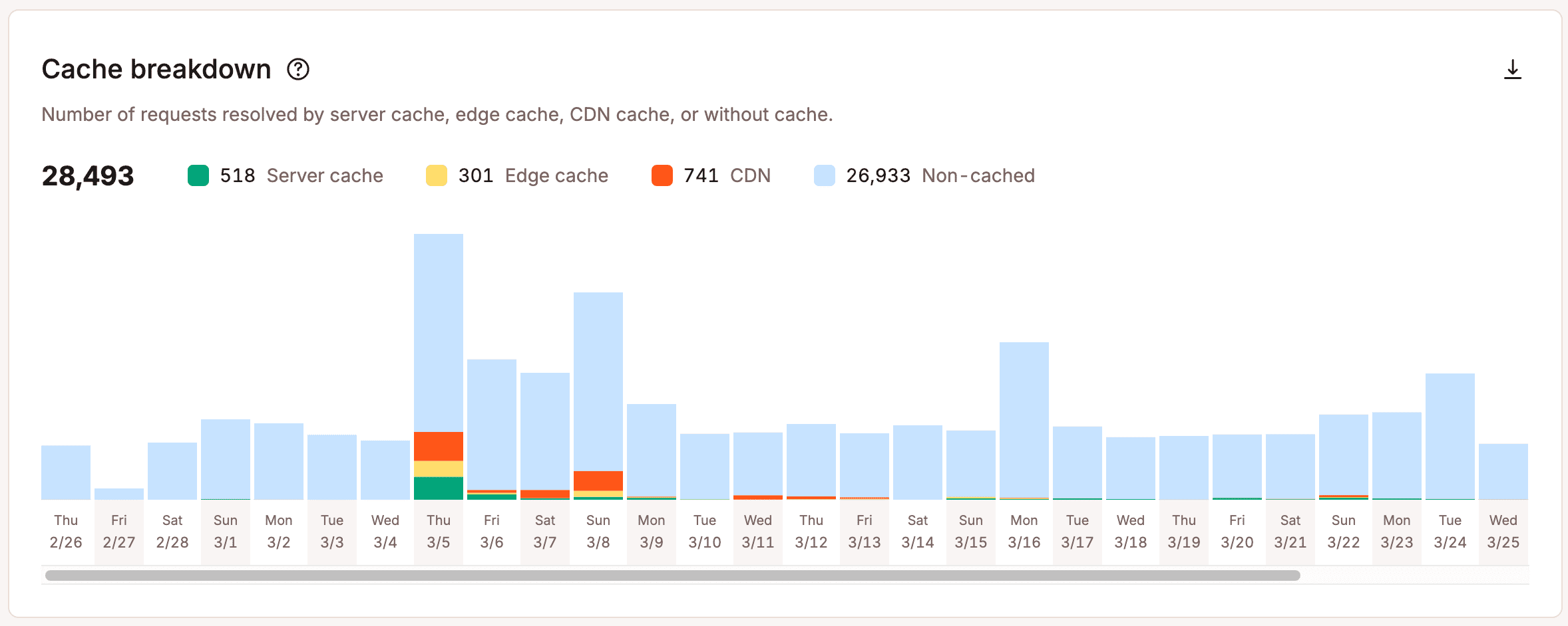
Cache breakdown
The Cache breakdown report shows the number of requests handled by each caching layer and which requests were served directly from the server (Non-cached).
The number of non-cached requests is calculated as the total of cache misses and bypasses across all cache layers. Because a single request can pass through multiple cache layers (server, edge, and CDN), the same request may be counted more than once if it misses or bypasses cache at multiple levels.
For this reason, the total non-cached requests may not match the Server cache component stack chart, which only includes requests handled at the server cache layer.
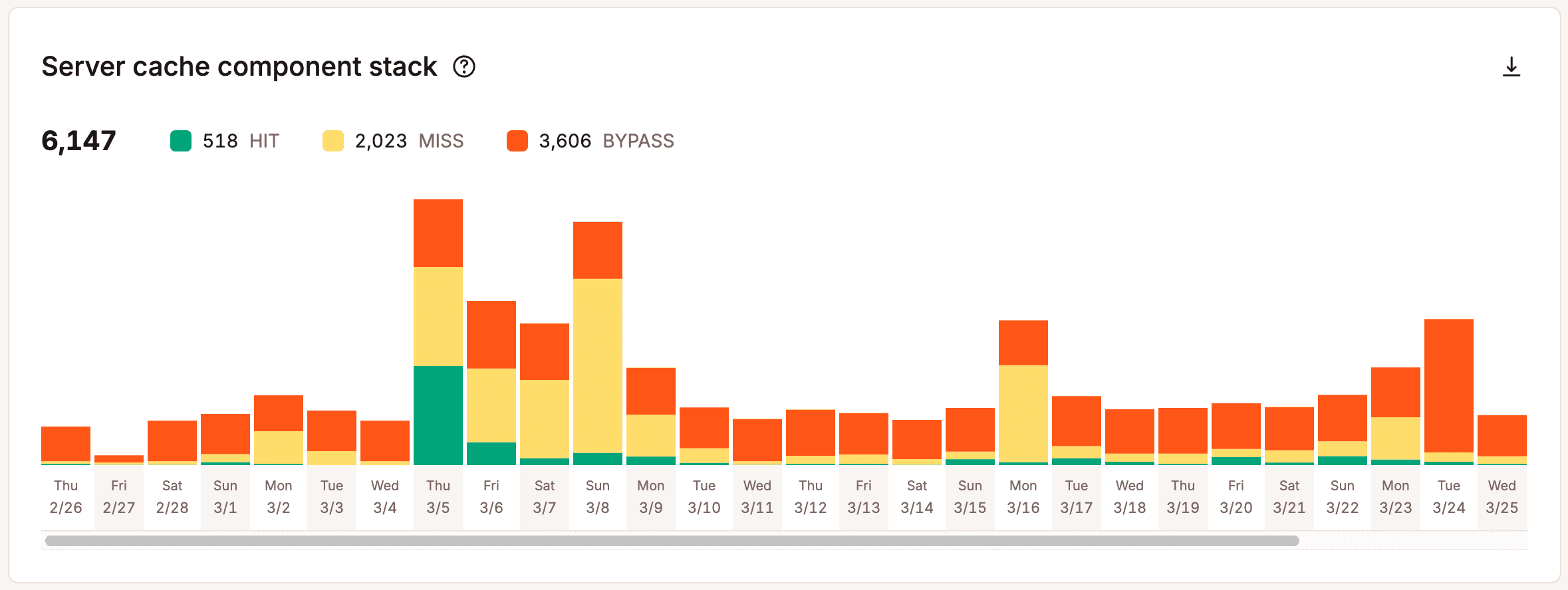
Server cache component stack
Whenever a file or resource is requested from Kinsta’s servers, it sends a value in the HTTP response header (X-Kinsta-Cache) to let you know the status of the cache. There are four types of cache response headers returned:
- HIT: A HIT means that the resource is being served from the cache on Kinsta’s servers. Typically, this is what you want to see.
- BYPASS: This means that a rule or conflict is probably preventing the resource from caching. We have rules in place so that certain things on your WordPress site aren’t cached. For example, your /wp-login.php page isn’t cached, which ensures proper functionality when you log in to your dashboard.
- MISS: This means that the content was not yet in the cache but will be after the first request. The second request to that file will be a cache HIT. Remember that each time you purge the cache on your WordPress site, it has to be rebuilt by people visiting it. This is why we recommend not clearing the entire cache constantly. The Kinsta MU plugin automatically purges only certain sections of your site so the rest can remain cached. Read more about how Kinsta handles caching.
- EXPIRED: This means the cached content has expired, and the new content from the hosting server has been fetched.
The Server cache component stack report shows the total number of cache response header values generated from your site.
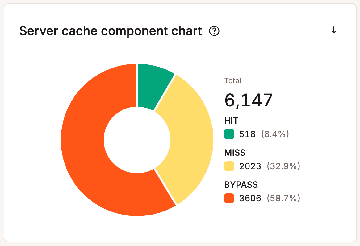
Server cache component chart
The Server cache component chart is another way to view your total cache response header values.
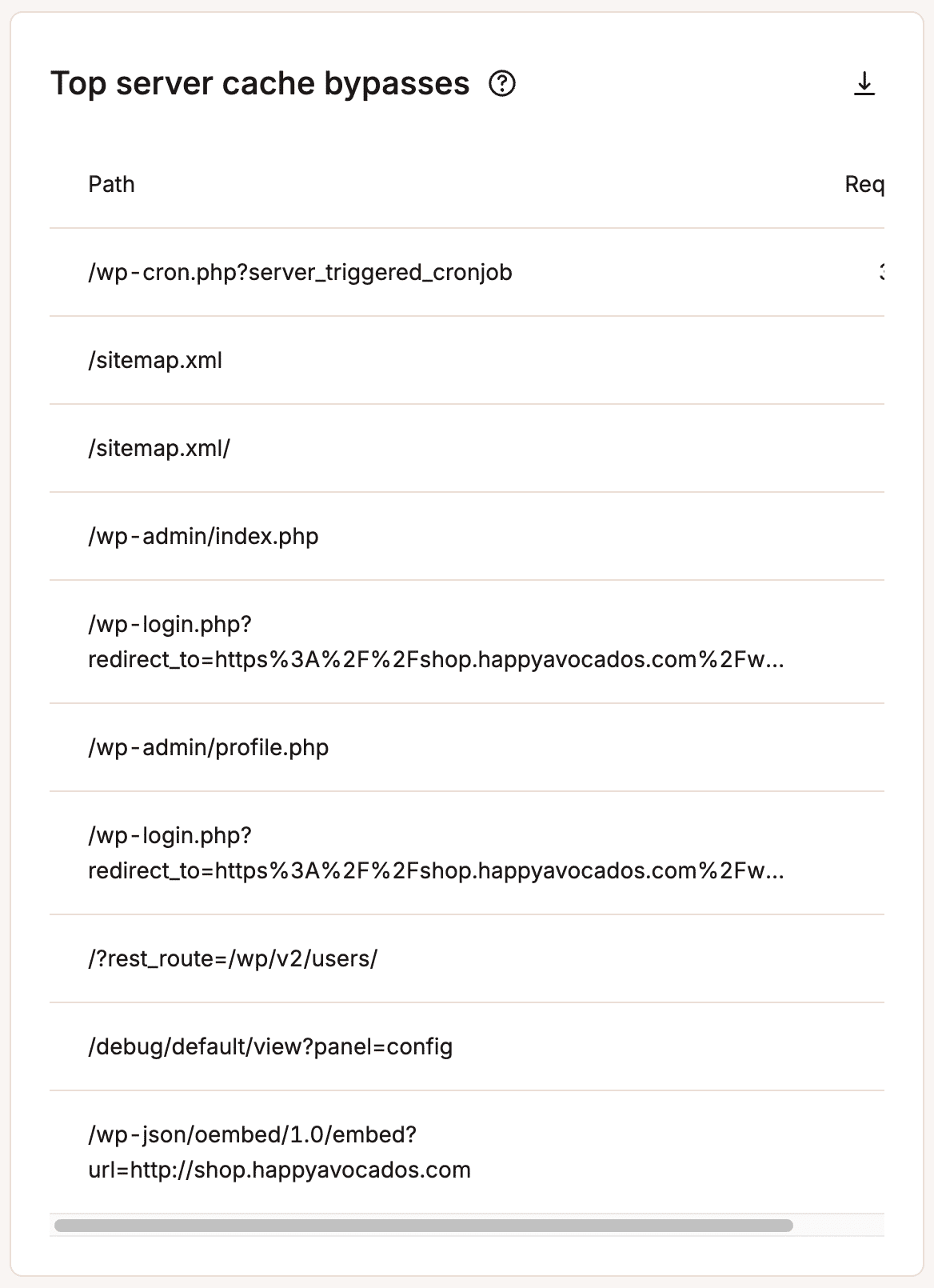
Top server cache bypasses
The Top server cache bypasses report shows the top requests that bypass the cache on your site. We recommend you take a look at this and make sure those paths should be bypassing the cache.
CDN & edge
Under the CDN & edge section, if Kinsta’s CDN is enabled, you can view your CDN bandwidth, top files by requests, top files by bytes, and top file extensions by bytes. If a particular media file from your site is hogging all of your bandwidth, you can spot it here.
CDN bandwidth
The CDN bandwidth usage report shows the total CDN data your site has used.
If you highlight a specific point in time on the graph, it will show you some comparison data, such as the percentage difference between each day.

Edge cache bandwidth
This chart shows the total data served by the edge cache.
If you highlight a specific point in time on the graph, it will show you some comparison data, such as the percentage difference between each day.

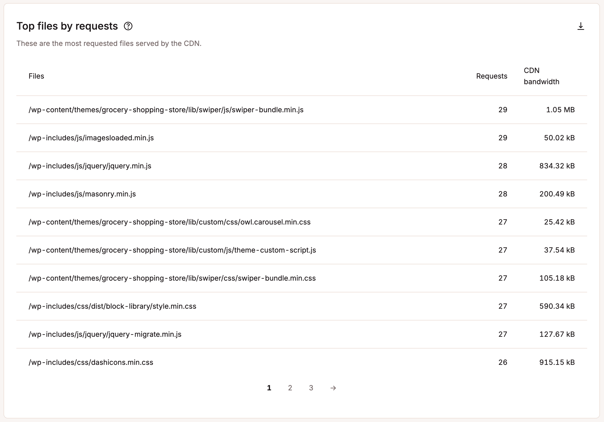
Top files by requests
The top files by requests report shows you the most requested files on your site served by the CDN. This can help you identify which files are responsible for most of your CDN bandwidth usage.
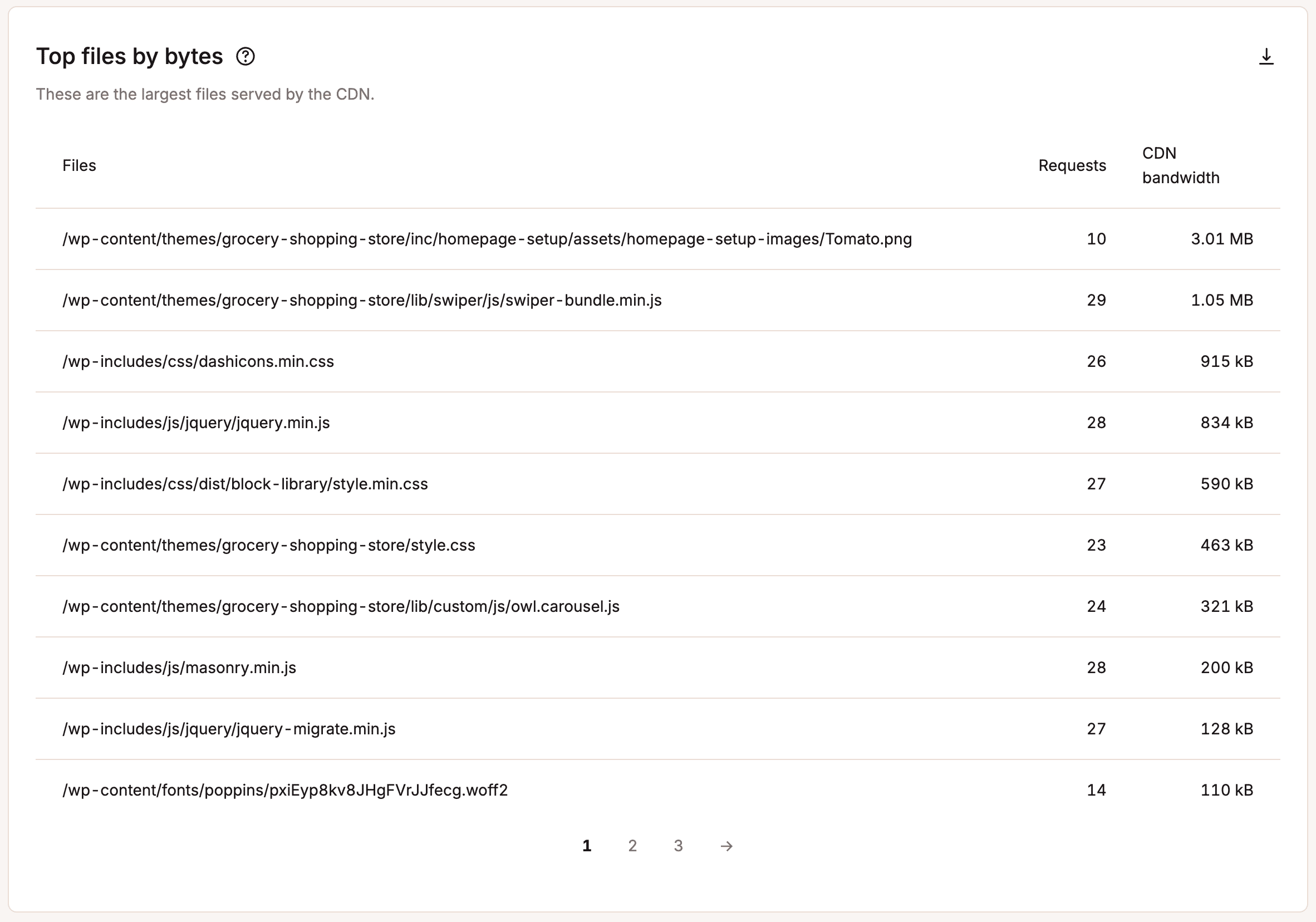
Top files by bytes
The top files by bytes report shows you the largest files on your site served by the CDN. This can help you identify large files that you may be able to optimize, reducing the file size and your CDN bandwidth usage.
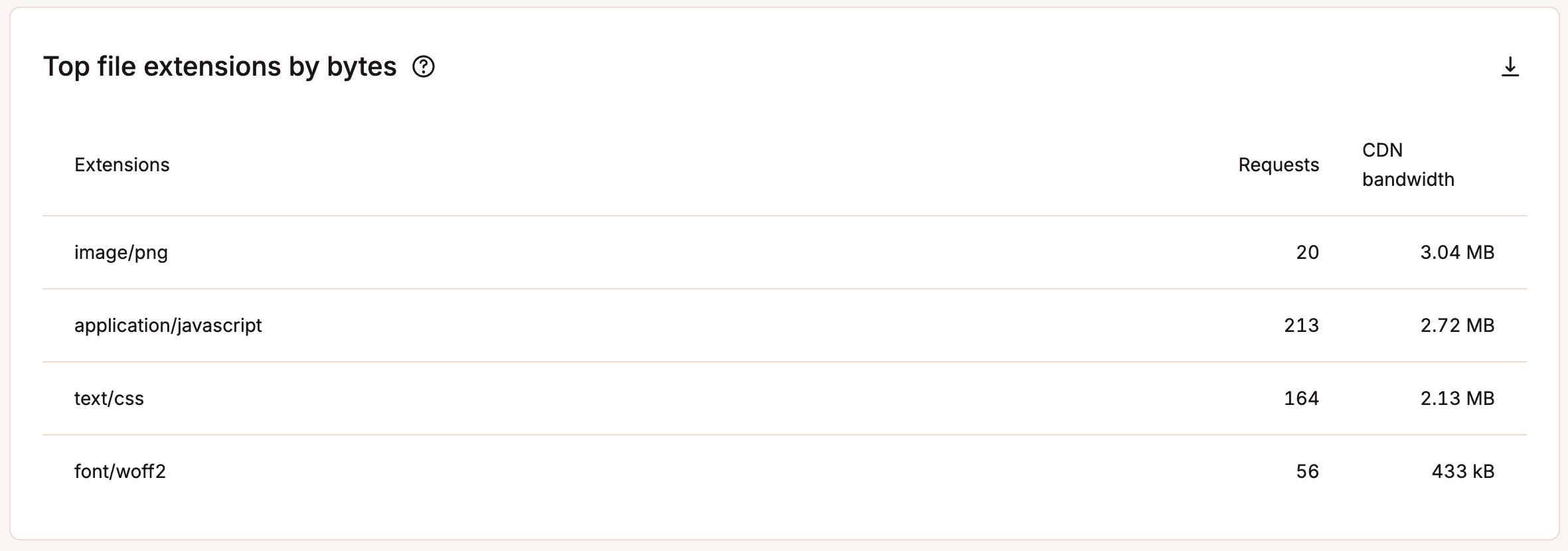
Top file extensions by bytes
The top file extensions by bytes report shows you the top X file extensions served by the CDN. This can help you identify the type of media on your site responsible for most of your CDN bandwidth usage.
Dispersion
Under the Dispersion section, you can view different insights about the traffic on your site.
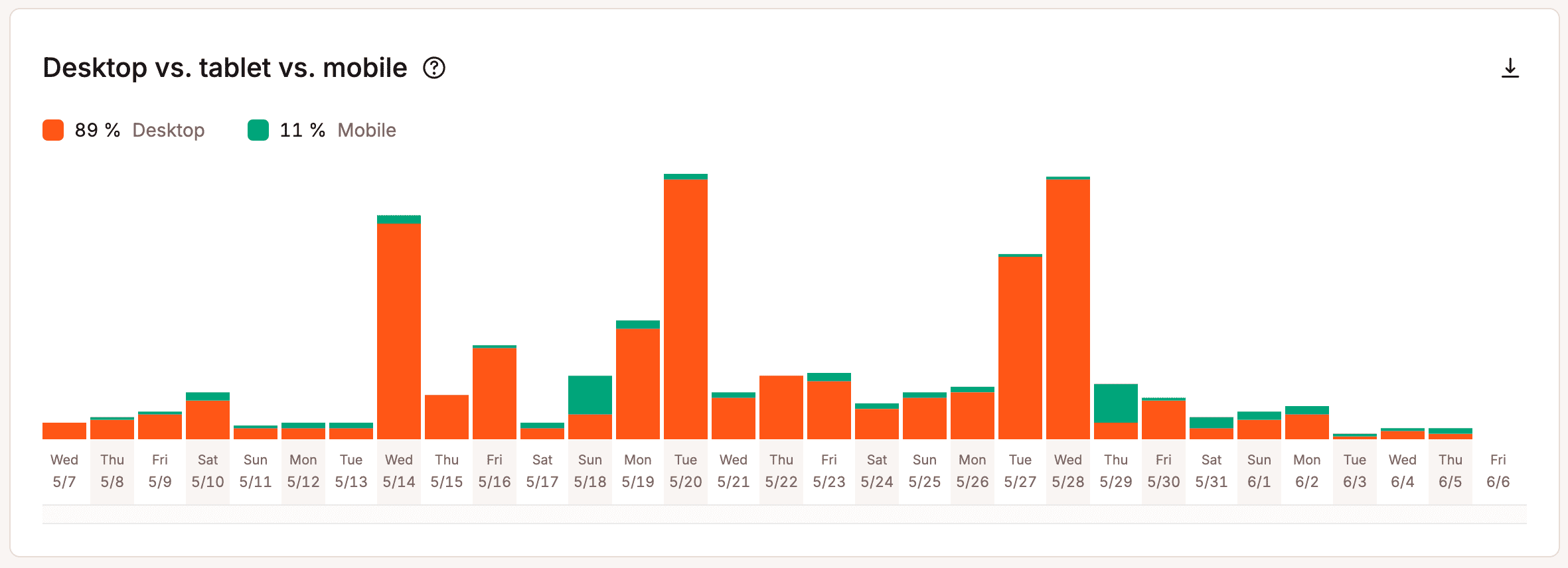
Desktop vs. tablet vs. mobile
The desktop vs. tablet vs. mobile chart lets you see which devices are hitting your site. In the example below, you can see that it’s primarily desktop traffic at 95%.
Performance
Under the Performance section, you can view your average PHP + MySQL response time, PHP throughput, PHP memory limit reached, PHP thread limit, AJAX usage, top average PHP + MySQL response time, and top maximum upstream time.
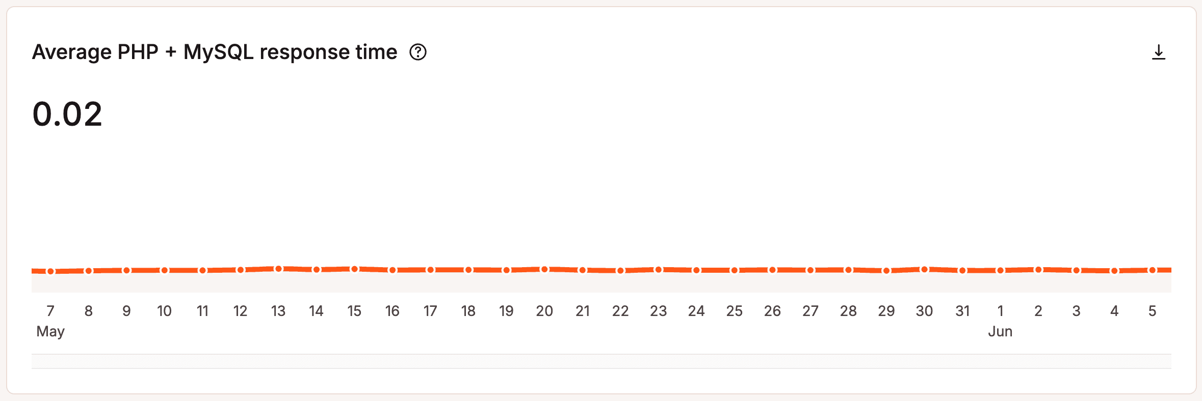
Average PHP + MySQL response time
Whenever you visit a WordPress site, PHP and MySQL are used to compile and query the data you see on the page. This chart shows you the average response time of the PHP engine and the MySQL engine for every uncached request.
If this value is high or shows a recent spike, feel free to open up a new chat with our Support team so they can check for any server-related issues. If no server-related issues are found, we recommend using our APM tool to help diagnose performance issues.
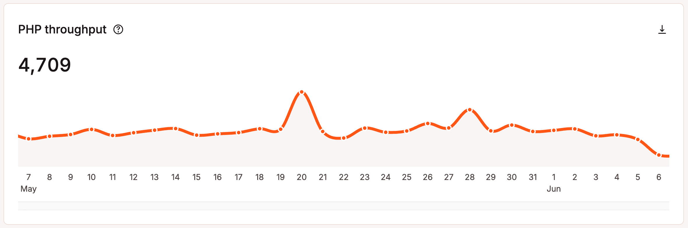
PHP throughput
Throughput is the number of transactions per unit of time. In this report, it refers to PHP throughput from your WordPress site. In other words, it shows how many total requests were executed for the selected time frame. The line graph shows a more detailed breakdown by hours or days (depending on the time frame).
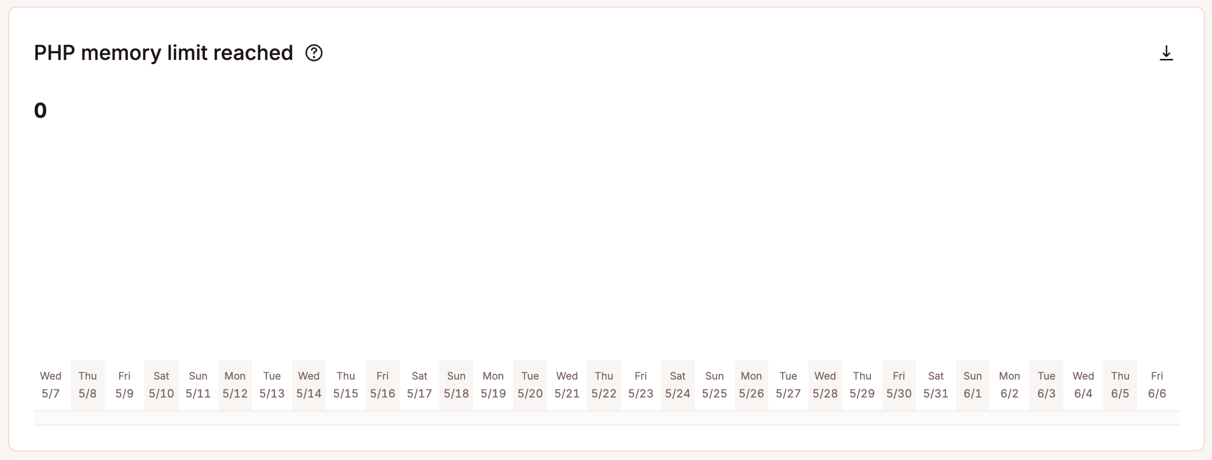
PHP memory limit reached
This chart shows the number of times the PHP memory limit was reached. Kinsta’s default PHP memory limit is 256MB, which is more than enough for most WordPress plugins and sites. This limit exists to prevent PHP scripts from consuming excessive memory. If you set the limit too high, a misconfigured or broken script can cause serious issues by using up too much memory. If your site is set up correctly at Kinsta, you shouldn’t reach the PHP memory limit.
You can change a site’s PHP memory limit per thread within Sites > sitename > Info > PHP performance > Change. If you increase the memory per thread, this reduces the number of PHP threads available and, therefore, reduces the number of incoming requests your site can handle simultaneously. However, you can also change your Total memory pool to increase both the number of threads and memory available for your site.
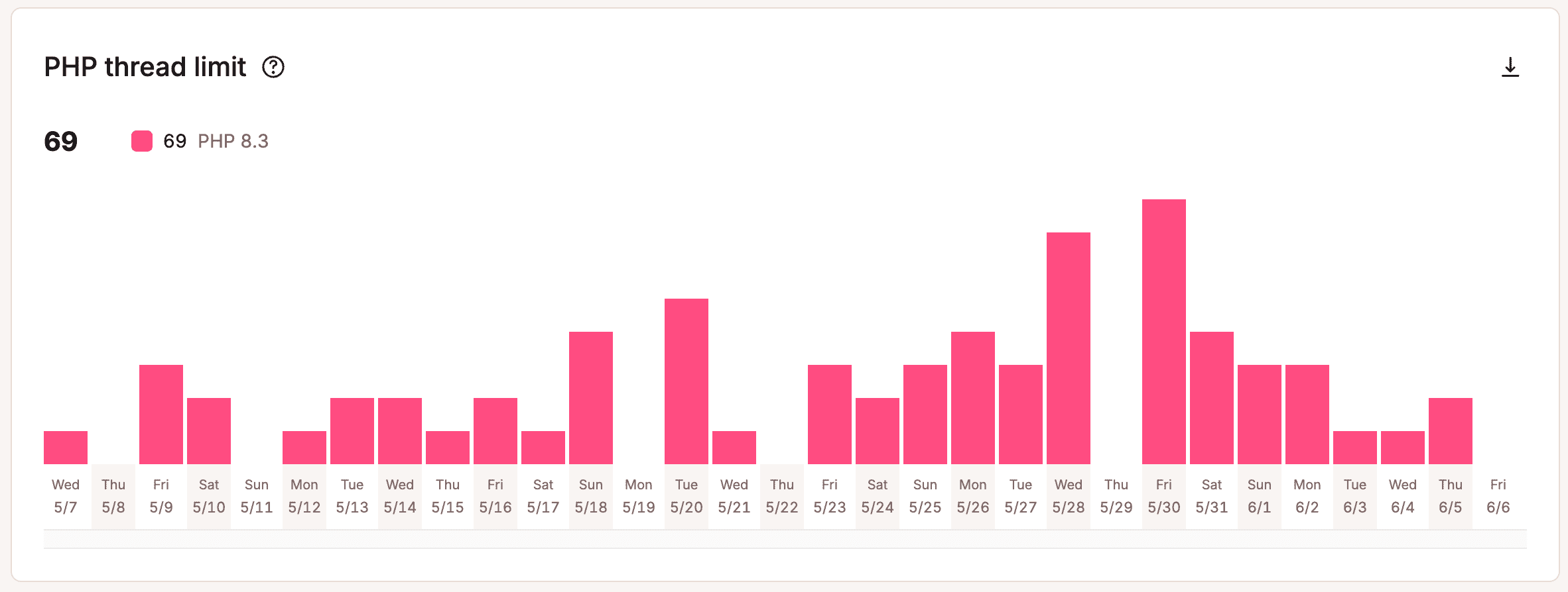
PHP thread limit
The PHP thread limit chart shows how often the PHP engine reached the maximum allocated PHP threads. For example, if your plan includes 4 PHP threads, and your site utilizes all 4 PHP threads simultaneously and cannot immediately respond to incoming PHP requests, that would count as one instance of reaching the PHP thread limit.
This may only give you a partial picture of your PHP thread activity as this only records the number of times the PHP thread limit is reached and not how long all PHP threads were in use.
Each hosting plan at Kinsta includes a default number of PHP threads. You can change the number of PHP threads for each site within Sites > sitename > Info > PHP performance > Change. If you increase the number of threads, this reduces the memory limit per thread; however, you can also change your Total memory pool to increase both the number of threads and memory available for your site. The information in this chart can help you gauge whether or not your site is continuously hitting limits.
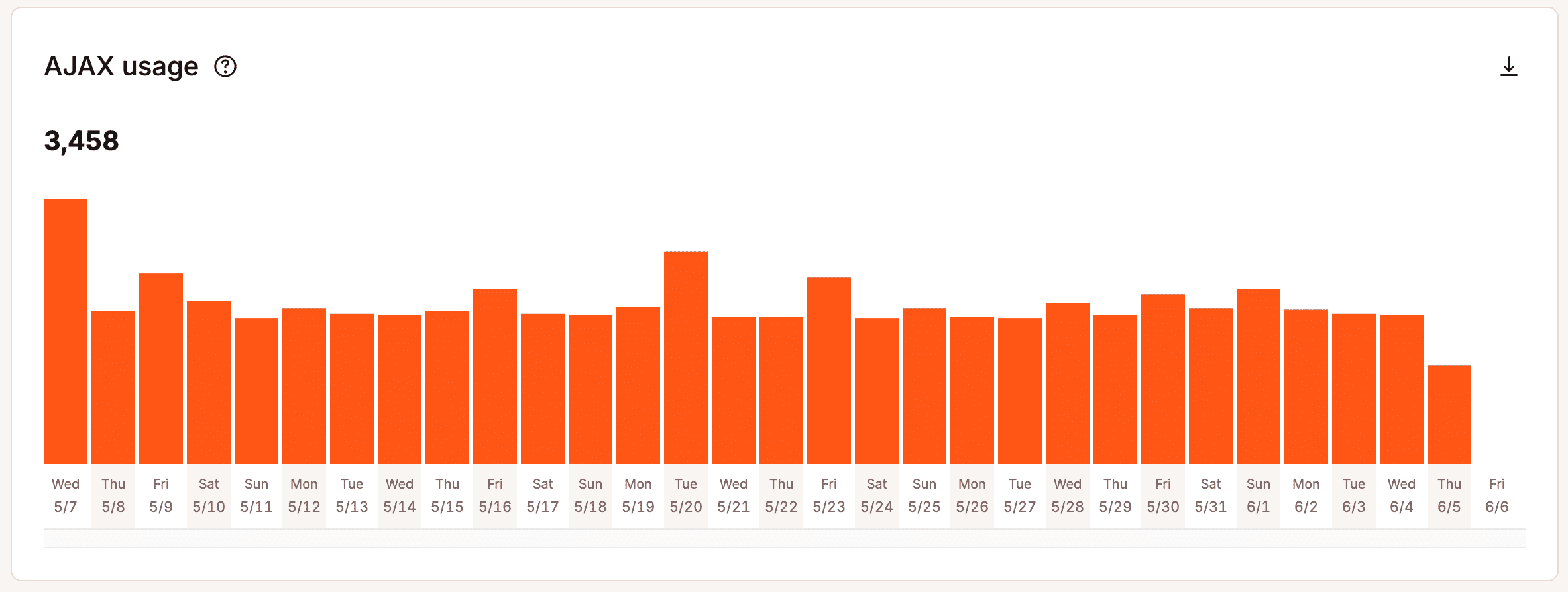
AJAX usage
AJAX (Asynchronous JavaScript and XML) is a term that describes using a client-side script that lets you update parts of a web page without having to do a postback or page refresh.
When it comes to WordPress, you may have seen admin-ajax.php in your speed tests. WordPress uses Ajax for core admin features like auto-saving posts, user session management, and notifications. The Ajax calls for those features are done through the admin-ajax.php file in /wp-admin.
The most common issues with Ajax in WordPress are plugins causing it to spike and CPU issues on the back end. For more details, check out our in-depth post on diagnosing high Admin-AJAX usage on your WordPress site.
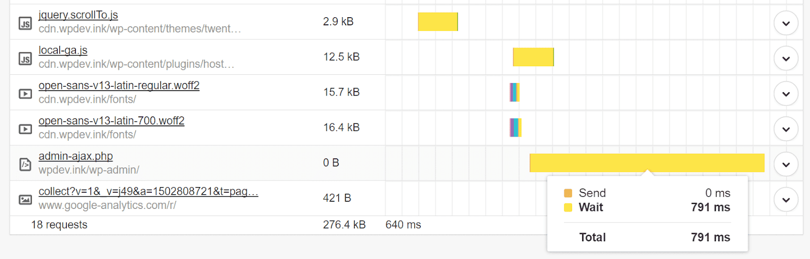
The AJAX usage chart shows the count of the admin-ajax requests, and you can see if there are Ajax usage spikes during specific periods. Select one of the bars in the chart, and you can see the number of Ajax requests for that particular time period. You can then utilize some of the tips in the post we mentioned above to narrow down the source of those spikes.
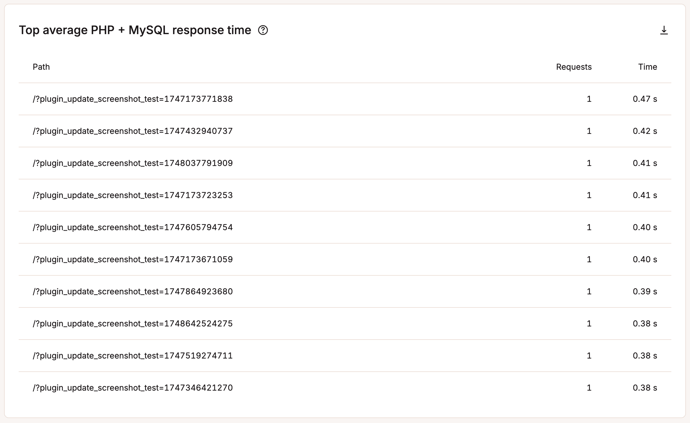
Top average PHP + MySQL response time
This list shows the paths with the top response times from PHP and MySQL. The time is the average per request, not the total time for all requests. These numbers can be one-time peaks, so it’s best to compare this list with the Top maximum upstream time list.
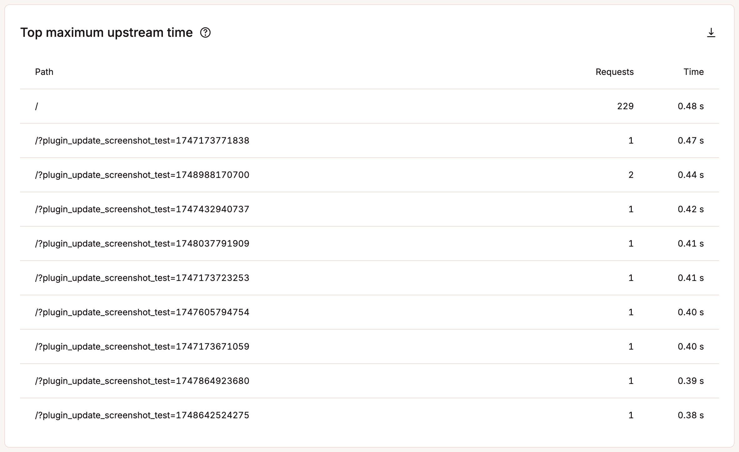
Top maximum upstream time
Upstream time is the total time taken for NGINX (and upstream servers) to process a request and send a response. This list shows the paths with the top PHP and MySQL upstream times (combined) for requests. The time is per request, not the total time for all requests.
Response
Under the Response section, you can view your response code breakdown, response stats, 500 error breakdown, 400 error breakdown, redirect breakdown, and top 404 errors. Check the HTTP status and redirect chain of any URL with our free HTTP status and redirect checker. You can use this tool to review response headers, client-side errors, and test your redirects to ensure they work the way you want them to.
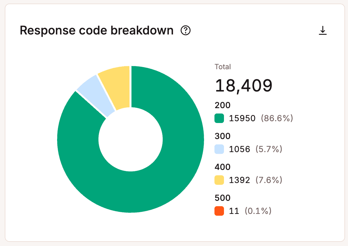
Response code breakdown
The Response code breakdown chart lets you see an overview of the distribution of HTTP status codes served for the requested resources. Response codes, also known as HTTP status codes, are not always bad. For example, a 200 HTTP status code means “Everything is OK.” This code is delivered when a web page or resource acts exactly the way it’s expected to. We’ll go into the others further below.
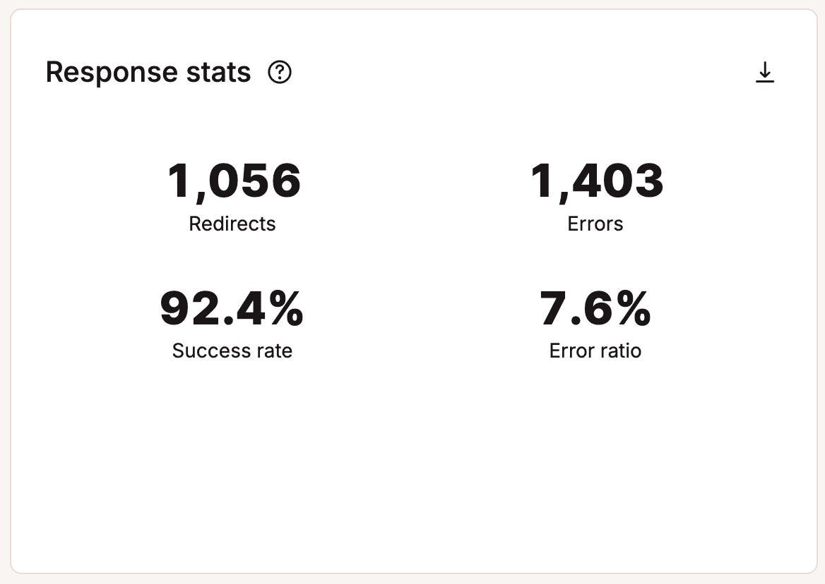
Response stats
The Response stats report shows you the total number of redirects, errors, success rate, and error ratio. Every WordPress site will typically have a slight error rate ratio, which is completely normal.
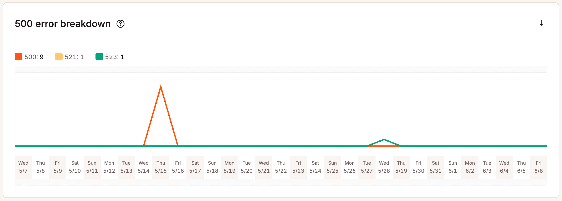
500 error breakdown
The 500 error breakdown chart shows you the total number of 500 errors that occurred on the server. Here is a more in-depth explanation of what each of these means:
- 500: “There was an error on the server and the request could not be completed.” A generic code that means there was an “internal server error.” Something went wrong on the server, and the requested resource was not delivered.
- 502: “Bad Gateway.” This error code typically means that one server has received an invalid response from another. Sometimes a query or request will take too long, so it is canceled or killed by the server. Read more about how to fix a 502 bad gateway error.
- 503: “The server is unavailable to handle this request right now.” The request cannot be completed right now. This code may be returned by an overloaded server that cannot handle additional requests. We have a step-by-step guide on how to fix the 503 service unavailable error in WordPress.
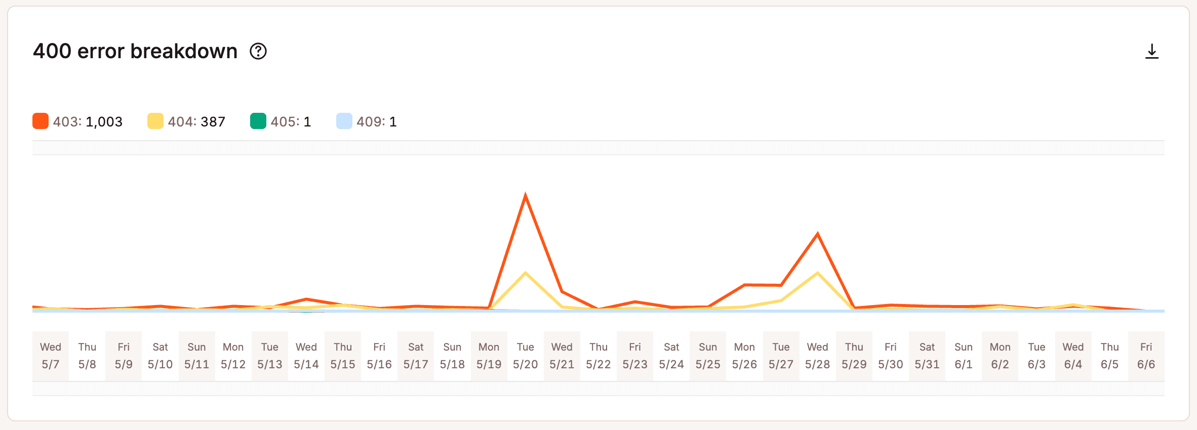
400 error breakdown
The 400 error breakdown chart shows you the total number of 400 errors that occurred on the server. Here is a more in-depth explanation of what each of these means:
- 401: “Unauthorized.” The server returns this error when the target resource lacks valid authentication credentials.
- 403: “Access to that resource is forbidden.” This code is returned when a user attempts to access something they don’t have permission to access. For example, trying to view password-protected content without logging in might produce a 403 error.
- 404: “The requested resource was not found.” The most common error message of them all. This code means that the server can’t find the requested resource, and the server does not know if it ever existed.
- 405: “Method not allowed.” This error is generated when the hosting server (origin server) supports the method received, but the target resource doesn’t.
- 429: “Too Many Requests.” The server typically generates this error when the user has sent too many requests in a given amount of time (rate limiting). Often, this is caused by bots or scripts trying to brute-force their way into your default WordPress login page. You can help lock down your site by changing your WordPress login URL.
- 499: “Client closed request.” This error is returned by NGINX when the client closes the request while NGINX is still processing it.
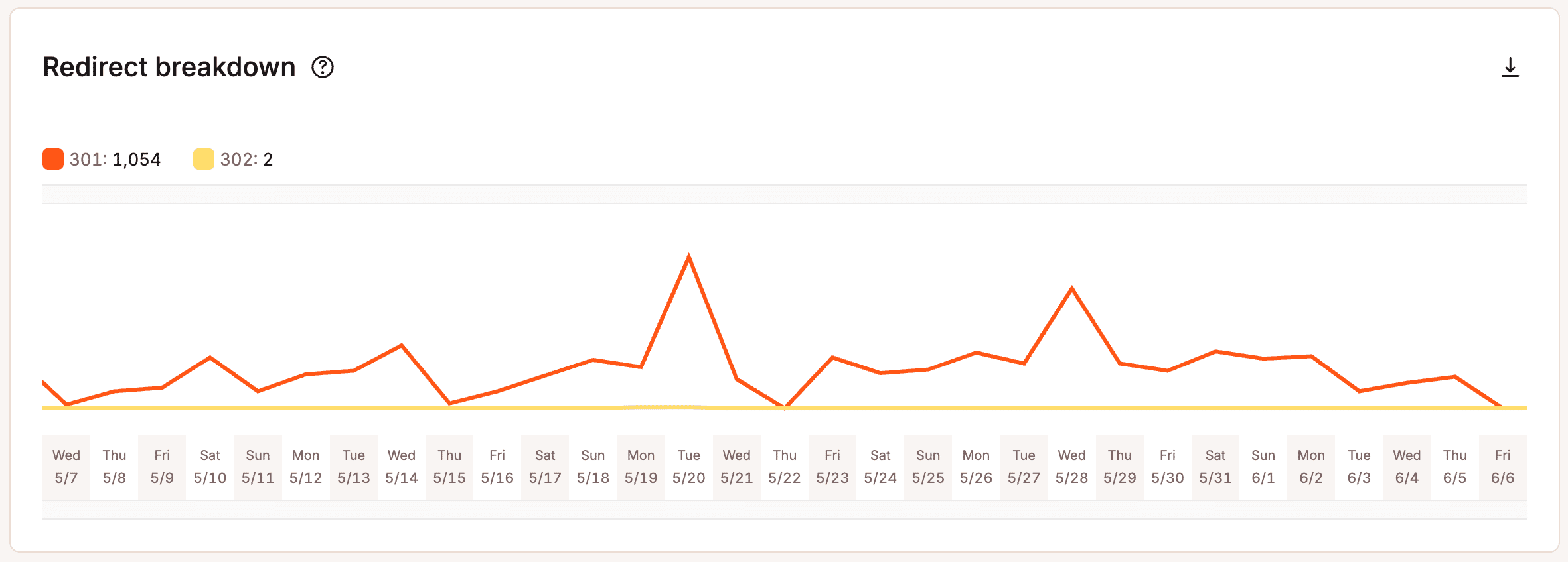
Redirect breakdown
The Redirect breakdown chart shows you the total number of redirects that occurred on the server. Remember that like 200 response codes, not all response codes are bad. 300 response codes typically mean you have moved the content elsewhere. 301 redirects, for example, are very important as they will help retain your SEO rankings for URL and site changes. Here is a more in-depth explanation of what each of these means.
- 301: “The requested resource has been moved permanently.” This code is delivered when a web page or resource has been permanently replaced with a different resource. It is used for permanent URL redirection.
- 302: “The requested resource has moved but was found.” This code indicates that the requested resource has been temporarily moved to a different location.
- 304: “The requested resource has not been modified since the last time you accessed it.” This code tells the browser that resources stored in the browser cache haven’t changed. It speeds up web page delivery by reusing previously downloaded resources.
Top 404 errors
The Top 404 errors list helps you troubleshoot the most requested resources that visitors or automated bots are hitting that do not exist on your site.
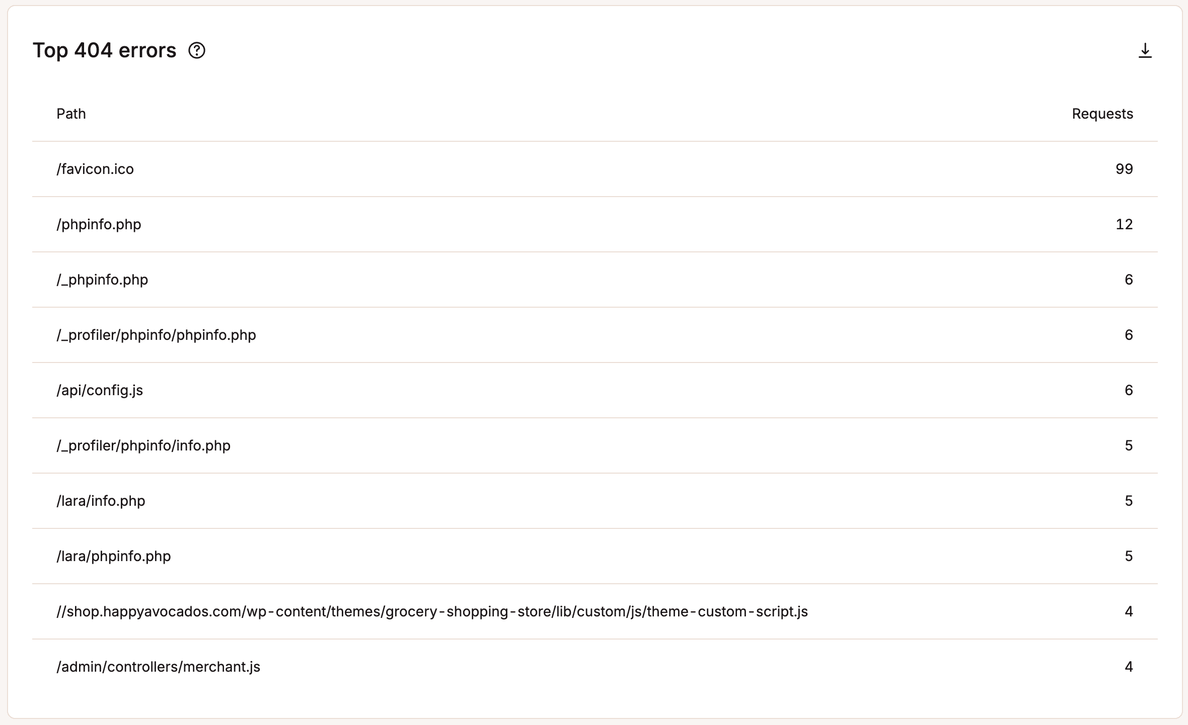
If you see a large number of 404 errors, it’s generally recommended that you go through your site and fix them for SEO and usability purposes. You can also look them up in Google Search Console under crawl errors.
Geo & IP
Under the Geo & IP section, you can view the top countries, cities, and IP addresses visiting your site. This gives you insights into the countries, cities, and individual IP addresses of visitors to your site.
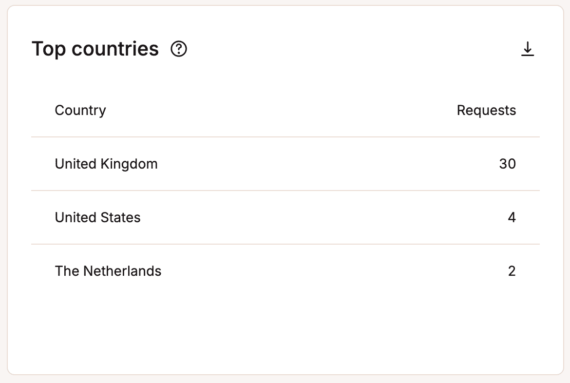
Top countries
The Top countries list can help you determine if the data center your site is in is the best location. This list is a geo-analysis by country of visitors’ IP addresses. In the example below, the site should probably be placed on a server in the United States since most of the traffic is from there.
Kinsta now has 28 data center locations around the globe where you can host your WordPress site. For more details, check out our in-depth post about network latency and why it’s important to place your site strategically.
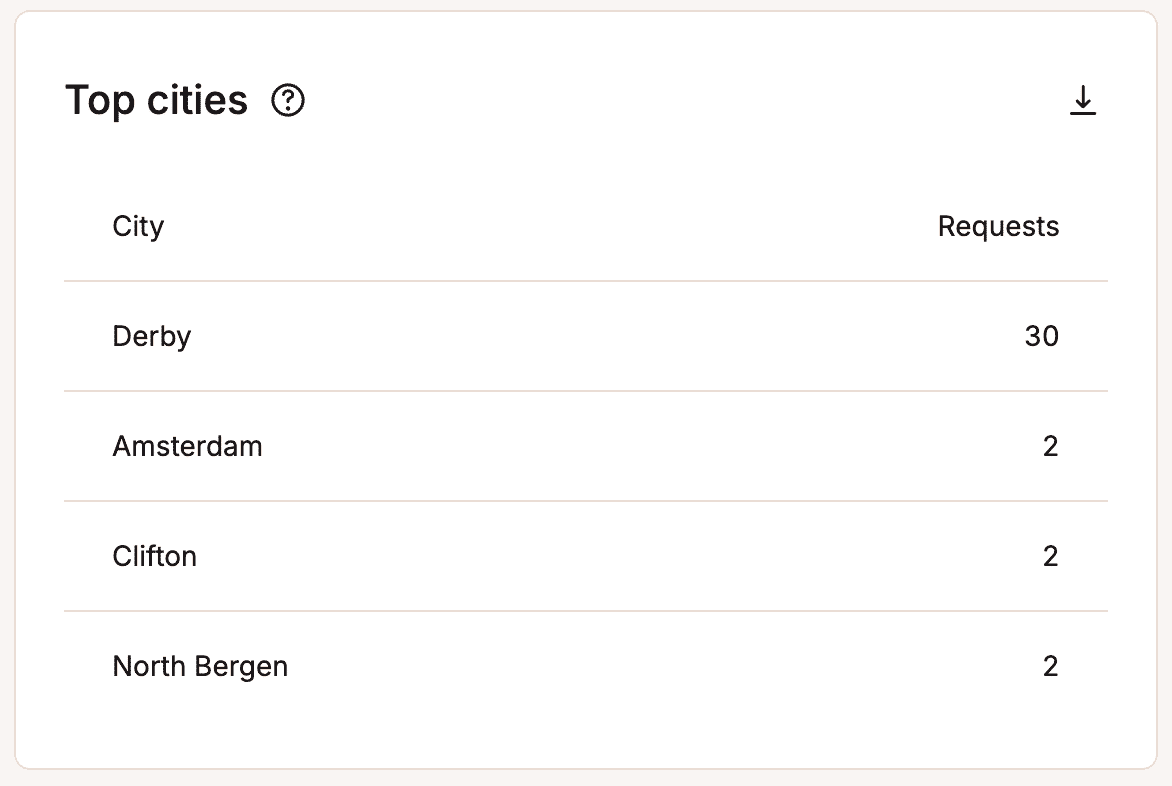
Top cities
The Top cities list shows you the geo analysis by city of visitors’ IP addresses.
Top client IPs
The Top client IPs list can be helpful if your site suddenly uses a lot of bandwidth. This shows the top IP addresses listed by request count.
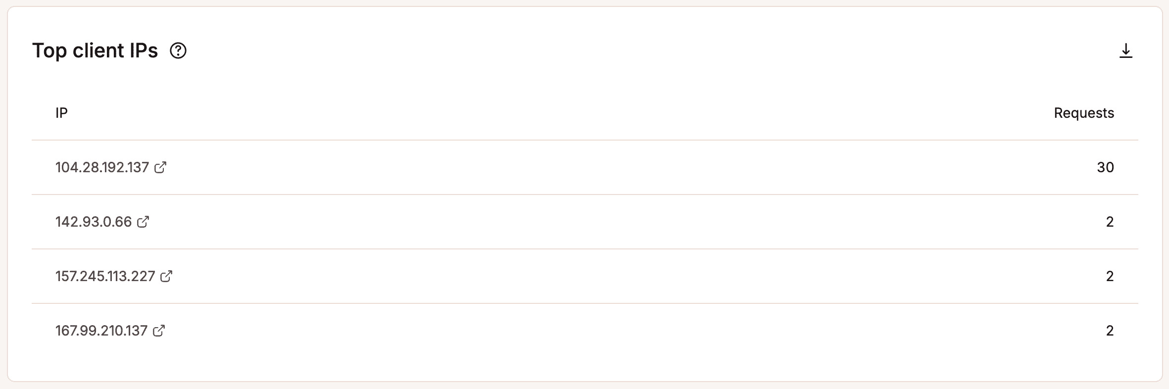
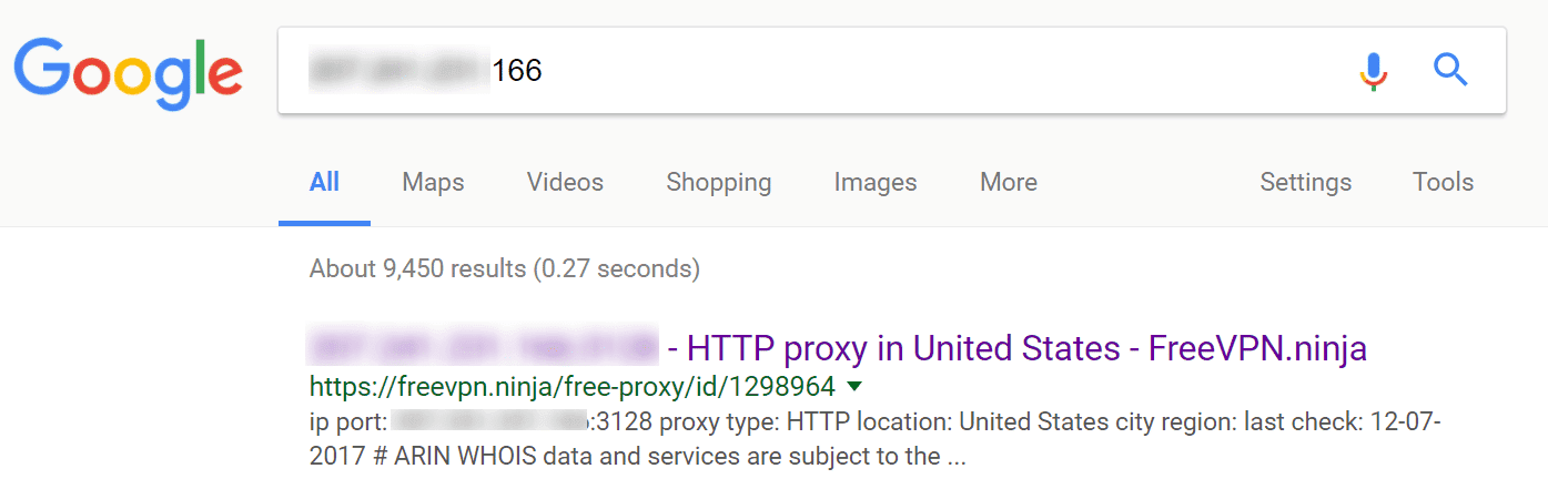
How can you use this data? Here’s an example of a case study on an e-commerce WordPress site. Analyzing the top 10 client IPs to the site for the last 7 days showed some suspicious activity. Most of them had over 10,000 requests, and there were quite a few IPs with this many requests. It was most likely a DDoS or brute force attack. Entering a couple of the top IPs into Google search, we could see that most of them were proxy addresses, meaning someone most likely wanted to hide their traffic.
The good news is, in addition to firewall protection, our Cloudflare integration also includes free DDoS (Distributed Denial of Service) protection. If you need further intervention, let our Support team know. If necessary, we can block the IPs for you.
Other options include setting up your own Cloudflare account (where you can enable and configure Cloudflare’s Web Application Firewall with more specific rules for your site) or adding a different web application firewall like Sucuri.
Bot traffic
With Kinsta’s bot protection, you can control how different traffic types are blocked or challenged on your site. The Bot traffic section gives you a breakdown of human vs automated traffic and whether the traffic was allowed or not.
Requests
The Requests chart shows you the number of requests from each traffic type, including:
- Likely humans: Real visitors who are most likely human with normal browsing behaviour.
- Verified bots: Automated traffic from legitimate, verified companies, such as Google, Bing, monitoring, and SEO tools.
- Likely bots: Traffic from unverified automation; these visitors are most likely bots.
- AI crawlers: A bot that scans and collects content from websites to be processed by AI systems. They are similar to traditional search engine crawlers, but instead of only indexing pages for search results, they gather data to train, analyze, or power AI models.
- Excessive-rate AI crawlers: AI crawlers making requests that overload server resources.
- Automated traffic: Confirmed automated requests generated by software rather than human users.
Find out more about how traffic is classified in MyKinsta.

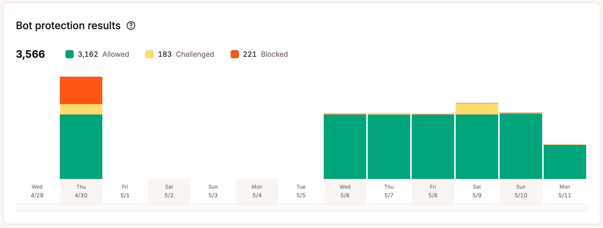
Bot protection results
The Bot protection results chart shows you the number of requests that have been allowed, challenged, or blocked through Kinsta’s bot protection.